Mirinda has unveiled a new global brand platform and visual identity system in a bid to appeal to Generation Z audiences.
The PepsiCo-owned brand hopes to cement its new ‘m’pactful’ look as a representation of the next generation.
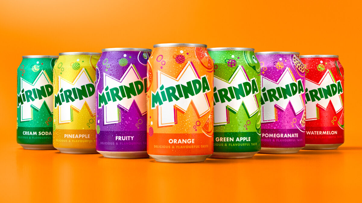
Developed by PepsiCo Design, the Mirinda logo has been given a brighter green, along with sharper corners and cleaner lines to ‘amplify its distinction’. The new visual identity also features ‘playful colour palettes’ which aim to provide a ‘burst of refreshment’.
Each of the brand’s 50-plus fruit flavours, including fan favourites Green Apple, Orange, Pineapple, Strawberry, and Watermelon, will be given a corresponding colour palette, each with their own contrasting colourways.

Subscribe to Marketing Beat for free
Sign up here to get the latest marketing news sent straight to your inbox each morning
“We are pleased to unveil Mirinda’s new global brand platform that inspires vibrant creativity, encouraging Gen Z to harness their uniqueness as a superpower,” PepsiCo vice president of global brand marketing, Eric Melis, said. “Through #NoFlavourLikeYourFlavour we have developed a refreshing new visual identity and platform, which Mirinda fans can identify with – one that empowers this generation to resist conformity and instead, embrace self-expression.
“This marks the first step for the brand as we continue to evolve and grow in line with the youth of today. We look forward to rolling out the exciting plans we have in the pipeline.”
The new visual identity will be visible on all Mirinda cans, merchandise, advertisements, retail displays and digital media across its 200 markets.
PepsiCo senior vice president and chief design officer Mauro Porcini added: “Mirinda’s 50+ flavours are a treat for the senses, and we wanted the brand’s visual identity to look and feel the same. PepsiCo Design and Innovation brought Mirinda to life with vibrant, contrasting colours and bespoke illustrations that create a sense of dynamic energy and playfulness. We know Mirinda fans engage with the brand digitally as much as they do physically, so we created a visual identity that retains its excitement and distinction across all platforms.”