

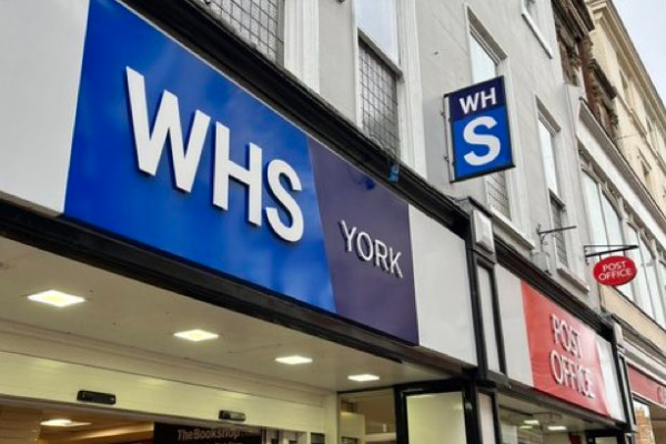
High street icon WHSmith has responded to the nationwide outcry following its controversial decision to rebrand some stores, with a new version of its logo appearing on some UK shopfronts.
The new-look logo featured a shortened version of the WHSmith name, repositioning it as ‘WHS’ in a surprise move which looks remarkably like the NHS logo and was widely derided by both the general public and those within the industry.
Following the outcry, WHSmith issued the following statement, confirming that the move was a test and the strength of public reaction meant it would be unlikely to be making it onto any more fascias.
“With some customers telling us they aren’t always aware of the wide range of high quality, great value products we stock in our high street stores, we are testing new signage at a small number of locations, to localise our offer and highlight the key product categories customers can always find at WHSmith,” it said.
“This is a trial and only in ten locations. There is no plan to roll this out to the rest of the estate.”
With more than 1,100 stores across the UK, WHSmith’s ten-store trial meant that the new logo appeared on less than 1% of its portfolio.
Subscribe to Marketing Beat for free
Sign up here to get the latest marketing news sent straight to your inbox each morning
If anything, the retailer should be reassured by the strength of feeling generated by such a small test.
However, part of the reason for much of the confusion and outcry surrounding the rebranding trial was the lack of consistency and foresight from WHSmith.
Trialling a new look across shopfronts – with no corresponding changes across other (more easily changed) brand touchpoints such as online or on social media – was a clunky move. Consumers are typically protective of heritage brands, and as such any changes need to be handled carefully and with consideration.
Global Data managing director of retail Neil Saunders tweeted: “Some Marks and Spencer stores are branded M&S. It makes sense because people have always called it M&S.”
“Very few have shortened WHSmith to WHS, so the rebrand doesn’t resonate. It also looks ugly and is too similar to the NHS logo. Waste of time and money!”
Some Marks & Spencer stores are branded M&S. It makes sense because people have always called it M&S. Very few have shortened WHSmith to WHS, so the rebrand doesn’t resonate. It also looks ugly and is too similar to the NHS logo. Waste of time and money! pic.twitter.com/HVYcdoA9Px
— Neil Saunders (@NeilRetail) December 27, 2023
Another X user wrote: “What is so annoying is that it takes just as long to say ‘WHS’ out loud as ‘WHSmith‘. And so everyone usually calls it ‘Smiths’ for short. Which is the bit they’ve taken out of the branding.”
“Terrible decision. (Before you even get to the fact that it looks too much like NHS”
What is so annoying is that it takes just as long to say “WHS” out loud as “WHSmith”.
And so everyone usually calls it “Smith’s for short. Which is the bit they’ve taken out of the branding.
Terrible decision.
(Before you even get to fact that it looks too much like NHS!) https://t.co/JwnPH55Fx2
— CAL ROSCOW (@calroscow) December 23, 2023


2 Comments. Leave new
Can’t decide, is it the Wonky Health Service, or just ‘Wuss’.
WH Smith must be the ugliest shop front on the High Street. The rebranding (of 1% of its estate) just made it even uglier! Keep the name; ditch the garish blue; upgrade the logo; and please, please do something about the window displays and inshore merchandising (the ‘pound’ shops do a better job!).