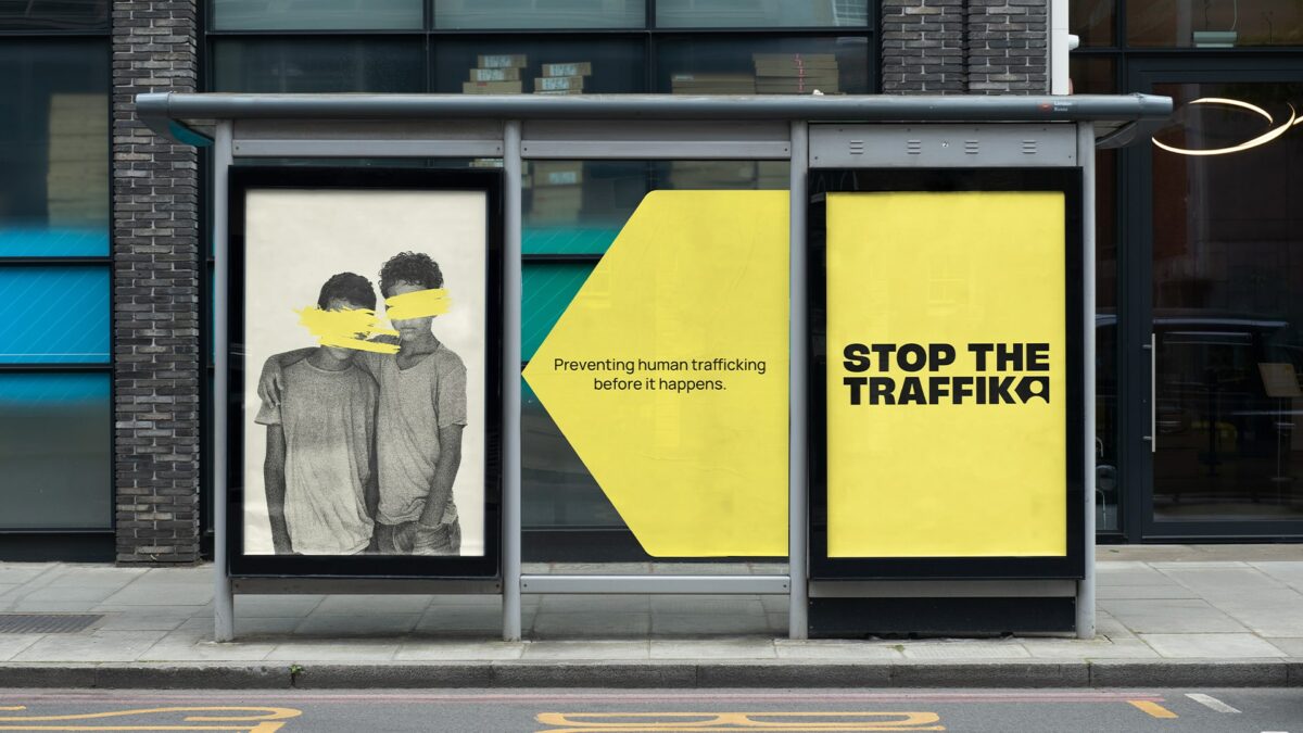
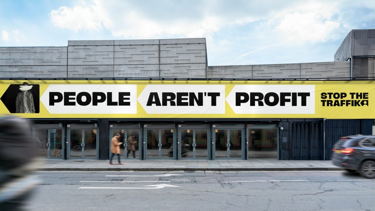
Human trafficking prevention charity Stop The Traffik has unveiled a new brand identity to help bring the vital importance of its work into the wider public spotlight.
Developed in partnership with London agency Fold7Design, the revamped visual identity will aim to help the charity better grab the people’s attention, highlighting its key role in trafficking prevention and intelligence gathering.
Centred around a new ‘Stop Arrow’ branding device, the visual will point backwards to provide a memorable visual trope that focuses on the ‘before’ and not the ‘after’.
“A brand is so much more than a logo. It has to capture character, share the story and importantly build a sense of belonging. As we approach our 20th anniversary in 2025, Fold7Design has gifted us exactly what we needed,” Stop The Traffik CEO, Ruth Dearnley said.
Subscribe to Marketing Beat for free
Sign up here to get the latest marketing news sent straight to your inbox each morning
“This exceptional team listened, created and delivered a solution that will put a spotlight on our work to prevent trafficking. By focusing on the Stop Arrow pointing backwards our brand will accelerate us all forward to predict, prevent and Stop The Traffik.”
Set to be accompanied by a wider campaign later in the year, the brand platform will be rolled out to all Stop The Traffik channels including its Stop app, which enables people to report instances of trafficking from anywhere in the world.
Fold7Design creative director, Tom Munckton added: “The team at Fold7Design are incredibly proud to have created Stop The Traffik’s new brand identity. Stop The Traffik’s work is almost entirely prevention focused – using technology, data and partnerships to provide the necessary steps to stop trafficking before it starts.”
“‘Prevention focused, intelligence-led’ became a brand idea that encompassed this – creating a modern, approachable and importantly, flexible new visual identity that can clearly showcase each distinct strand of their important work.”